Introduction: The First Question
Every project starts with a question. For the 10-episode Amazon Prime series Bambai Meri Jaan, the question that stuck with me from the moment I read the script was this: How do you visually tell the story of a man's quest for absolute control when it’s born from absolute chaos? This wasn't just about the character; it became the visual idea for the whole series. The story of Dara Kadri, a guy who would become a kingpin, was a story of duality. My job was to make the audience feel that split in every single frame.
The main idea, the one that guided every choice I made, was to explore the dichotomy between extreme external control and extreme inner chaos. This principle became the foundation of a massive, 440-page prep document—a beast filled with everything from abstract ideas to precise camera placements for scenes we wouldn't shoot for months. This post is a look back at that process, a diary of how we turned that dense blueprint into the living, breathing, and bleeding world of Bambai Meri Jaan.
Part I: The Philosophical Blueprint – The 'Why' Before the 'How'
Before you place a single light or choose a lens, you have to have a philosophy. The look of a show isn't just a decorative layer; it’s the soul of the story made visible. For Bambai Meri Jaan, our philosophy was built on two things: having a compassionate view of our main character and telling his story through a fractured lens.
A Lens of Compassion: Humanizing the 'Don'
Mafia stories can be tricky. They either romanticize their subjects or turn them into one-dimensional monsters. My main goal was to avoid both of those traps. From the beginning, the mandate was to approach Dara through a lens of compassion. We weren't telling the story of a monster, but of someone who has chosen what life he leads, for reasons, whether he knows the reasons or not. This meant the cinematography had a tough job: to humanize and yet not glorify our protagonist. The camera would be a close observer of his internal world—his ambitions, his fears, his scars—without ever making it seem like we approved of the brutal things he did. We wanted the audience to wonder how he does it, not to cheer for what he does.
The Inverted Mirror: A Father's Gaze, A Son's Path
The biggest decision that shaped our visual strategy was the narrative framing: telling this huge story through the eyes of his father, Ismail Kadri. This choice, which a bunch of reviewers later said was key to keeping the show from just glorifying a gangster, became our visual anchor. The audience would be stuck with Ismail's perspective. Like him, we’d sometimes get his son's choices and sometimes be totally mystified by them, watching from a distance as Dara spiraled into a world his father couldn't understand.
This father-son dynamic was a visual gift. They were two men who wanted the same thing—control over their lives—but whose moral compasses are inverted. Our visual language had to show this. When Ismail looks at his son, he cannot see him for who he is, only for who he wants him to be. This subjective, often cloudy, point of view became a recurring thing for us, letting us create a real sense of emotional distance and family tragedy.
In a way, the whole process of prepping for this show mirrored its main theme. The core philosophy was mafia, control to the extremes. To bring this to life, I put together that 440-page prep document, detailing everything from abstract color theory to specific dolly moves, floor plans, and lighting references. This insane level of planning was my own attempt to master the chaos of a massive, multi-decade production and force a single, controlled vision onto it. This process was a lot like Dara's own journey: a guy coming from a chaotic background who tries to build an empire through obsessive control. In getting ready to film a story about a man's obsession with control, I found myself doing the same thing, trying to map out and master every visual element before we shot a single frame. The prep document became my empire.

Part II: Designing a Language of Duality – The Grammar of the Image
Once the philosophical 'why' was set, the next step was to build the visual 'how'—a cinematic grammar that could express the story's central dualities. This meant making deliberate, sometimes extreme, choices in lensing, movement, color, and light.
The Extremes of Perception: A Bimodal Lensing Strategy
To visually show the gap between inner chaos and outer control, I decided to use an extreme, two-sided lensing strategy, consciously leaning away from the middle range lenses (when practical). Our world would be seen through two different points of view: the wide-open and the laser-focused.
Wide lenses became our tool for hope and love. They represented a bigger worldview, a mind that sees infinite options where others just see walls. These frames are about ambition, power, and a character’s feeling of command over their environment. I really like using wide-angle lenses up close to a character. As I noted in my proposal, you experience the world as they do. It creates a subjective feeling, putting the audience right in the character's head as they survey their world.
On the flip side, we used laser-focus longs for the moments after a choice has been made. Once the world of infinite possibilities narrows to one path, the lens narrows with it. These long-lens shots represent the unwavering focus needed to push forward, to lock onto a target and get rid of any indecision. They also did double duty. We used them to obscure intention or understanding, visually showing the emotional and moral distance between characters, especially a father's inability to really see his son.
The Grammar of Movement: In Praise of Control
In a time when action often means shaky, chaotic camerawork, we made a conscious choice to go the other way. I felt strongly that the story's drama was powerful enough on its own, and that the quiet, secret world of organized crime needed a more thoughtful approach. We rejected wild camerawork, handheld shots, and fast editing, aiming instead to give the story more importance through controlled classic storytelling.
Our main influence was Steven Spielberg's Munich. I think it's a masterpiece of precision classical storytelling, a film that builds incredible tension through quiet, subtle, and motivated camera movement. This became our guide. Every dolly, crane, or Steadicam move was motivated by a character's emotion or a story beat. This controlled approach was designed to give the series a timeless quality that would outlast whatever trends are popular right now. We even borrowed one of Munich's signature techniques: the long 70s dolly zooms, a tool we used to ramp up moments of paranoia or dawning realization.
Color as Subconscious Discomfort: The Wrong Note in the Chord
Our color theory was a direct extension of the main theme. The plan was to create a world that felt meticulously controlled, but with something deeply wrong underneath. We would establish very strict, well-controlled color palettes, and then intentionally throw in something that clashes. This one piece of the puzzle that doesn't match was designed to put the audience in a subtle state of discomfort.
The effect is subconscious. At first glance, the frame looks well-manicured and thoughtful, but that single wrong note—a clashing color in the set, an unsettling color in the lighting—signals the tension simmering just below the surface. It’s a visual way of showing that you're on a razor's edge from an eruption. You can see this strategy in our early camera tests, where we played with pushing rich red lower midtones in the skin for moments of passion and violence, contrasting them with the cool to neutral daytime exteriors of the normal world. The goal was to create a world of muted colors with a splash of color in the frame that explodes off the image.

An Atmosphere of Light and Shadow: A Triptych of Influence
Instead of sticking to one lighting style, we drew from three different cinematic influences, which let us pick the right approach for the emotional needs of any given scene.
Hype Williams' film Belly was our reference for pure, raw emotion. Its highly impressionistic use of primary colors was the inspiration for moments when we wanted to visualize the internal chaos boiling inside a character.
Road to Perdition provided the blueprint for external control. Conrad Hall's masterful work on this film has a subdued and classic feel, achieved through single-tone lighting and full control of the spectrum, which was perfect for scenes showing the rigid, ordered world of the mafia bosses.
Munich was once again our ultimate goal. Janusz Kamiński's cinematography is a masterclass in subtlety, using a single tone per scene with full control that still feels nuanced and layered. It strikes a perfect balance between control and naturalism, which was what we were aiming for throughout the series.

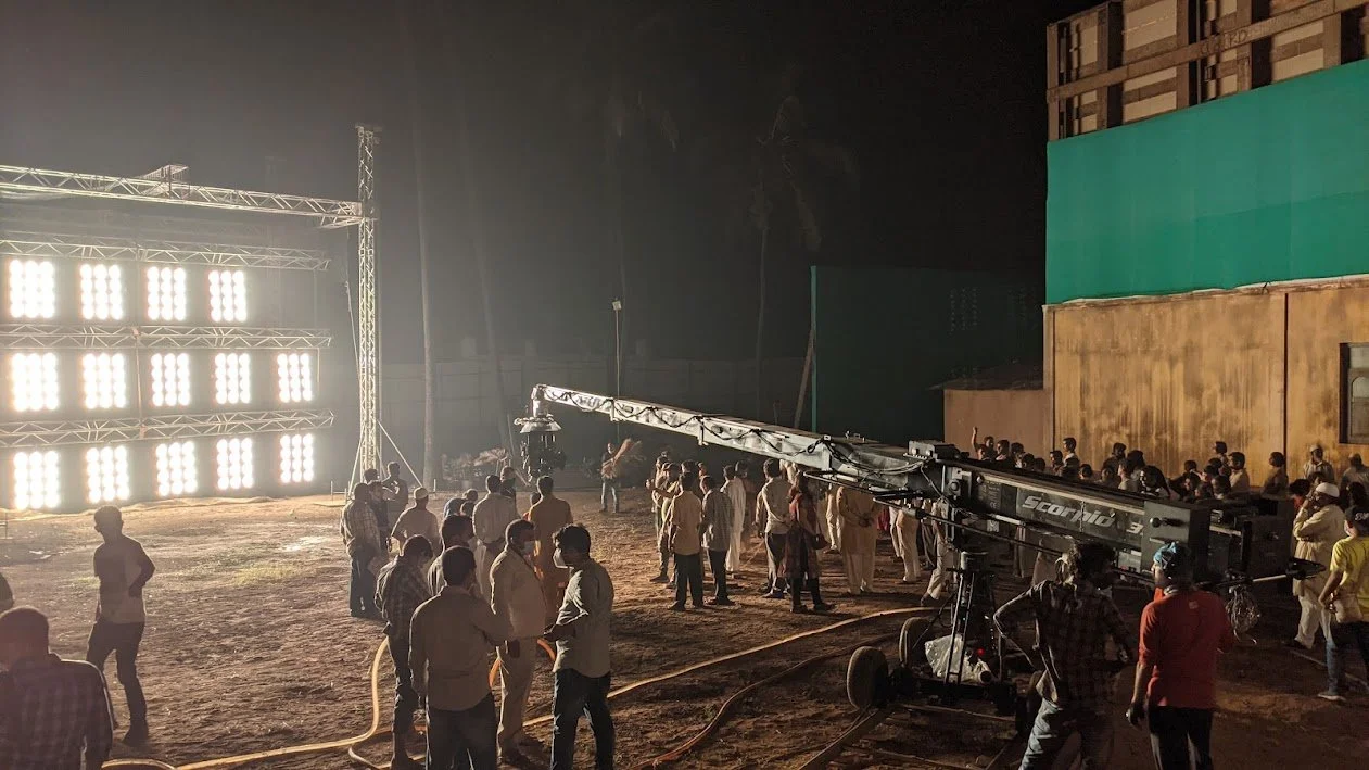
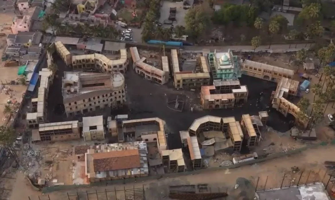
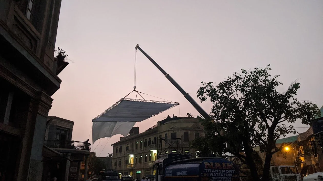
Part III: From Theory to Practice – Executing the Vision on the Streets of Bambai
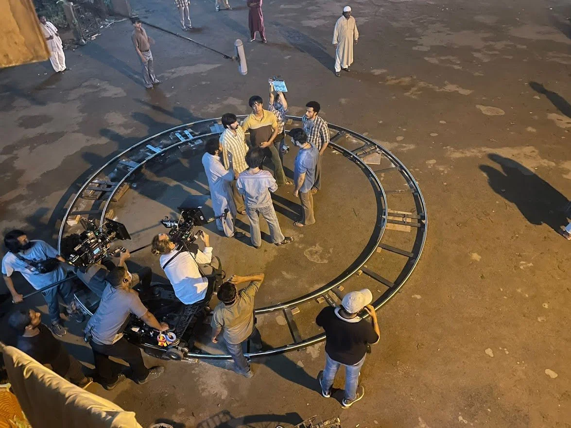
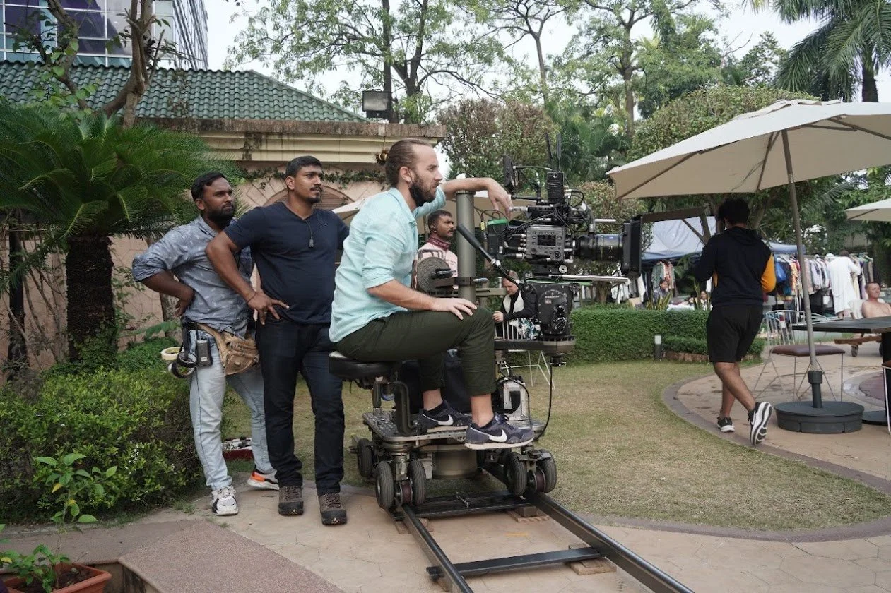
A philosophy is only as good as its execution. The bridge from that 440-page document to the final image on screen was built through careful planning, deep collaboration, and deliberately choosing the right tools for the story.
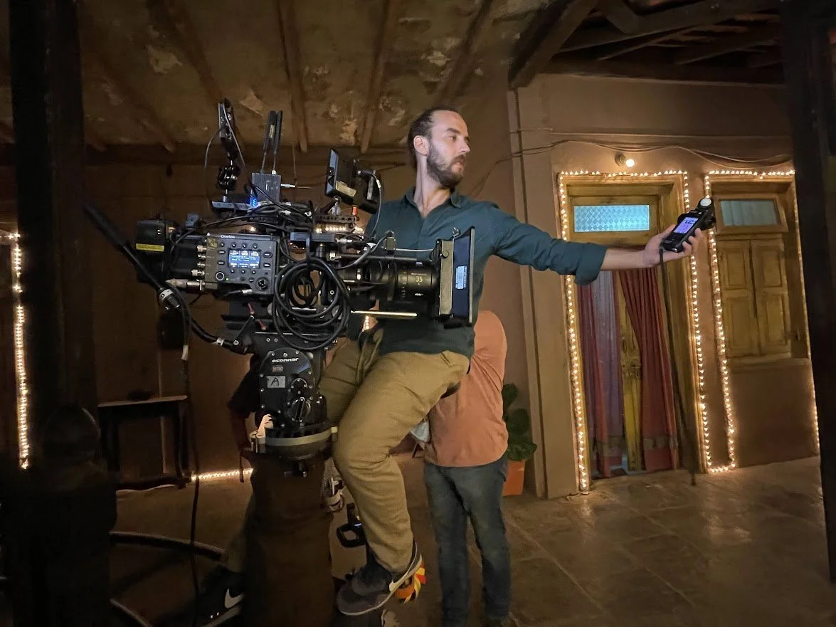
The DP as Architect: Shaping the World Before the Shot
My role as a cinematographer is about more than just capturing what's in front of the camera. It involves working closely with the production design team to shape the world itself. The location scout and prep documents are full of my notes that show this conversation. Comments on a photo of a windowed wall noted that I loved it, that the glass offers a lot of texture. For a gangster's den, I suggested we find references with darker walls, like in The Godfather, to give it an old-world charm that was both smart and thoughtful. A note asking if we could make a background red for a hospital scene shows that we were always trying to use color to raise the emotional stakes of a location, turning a sterile place into one of passion or dread.
The choice between a dolly, a crane, or a Steadicam was always a narrative choice. It dictates the audience's relationship to the action and the characters' power dynamics. A smooth, floating Steadicam shot, for instance, could provide a deceptively calm glide through a clearly hostile environment, visually representing a character's external control in a situation ready to explode. Elevating the camera on a crane could lift an act of street-level violence out of gritty realism and frame it as something larger and more tragic, giving the moment a sense of fate. Our philosophy of controlled, classic storytelling and movement motivated by emotion was translated directly into our gear selection for every sequence.
Once a project is out in the world, it doesn't just belong to the people who made it anymore; it enters into a conversation with its audience and critics. It has been great to see how many viewers and reviewers picked up on the specific visual language we worked so hard to create.
Connecting Intent to Reception
Reading reviews that describe the cinematography as "beautifully shot," "impactful," and noting how it captures the "violent nightlife in tones that are at once numbing and nostalgic" is hugely rewarding. It confirms that the mood we were going for was successfully communicated. One review from Scroll.in was particularly on point, observing that "The creeping darkness also inspires cinematographer John Schmidt's twilight-zone palette." This perfectly captures our goal: to create a visual world that mirrors the story's slow decay of morality, a world that's gradually losing its light.
Final Thoughts: From a Single Idea to a Sprawling Saga
The journey of making Bambai Meri Jaan was a testament to the power of having a unified visual philosophy. From a single, central question about control and chaos, an entire visual world was born. Every choice—every lens, every camera move, every shadow—was a deliberate step in building the complex, tragic, and deeply human world of the Kadri family. It was a privilege to lens their story, and my hope is that the visual language we created will continue to connect with audiences, inviting them not just to watch, but to feel the profound duality at the heart of this Bambai saga.